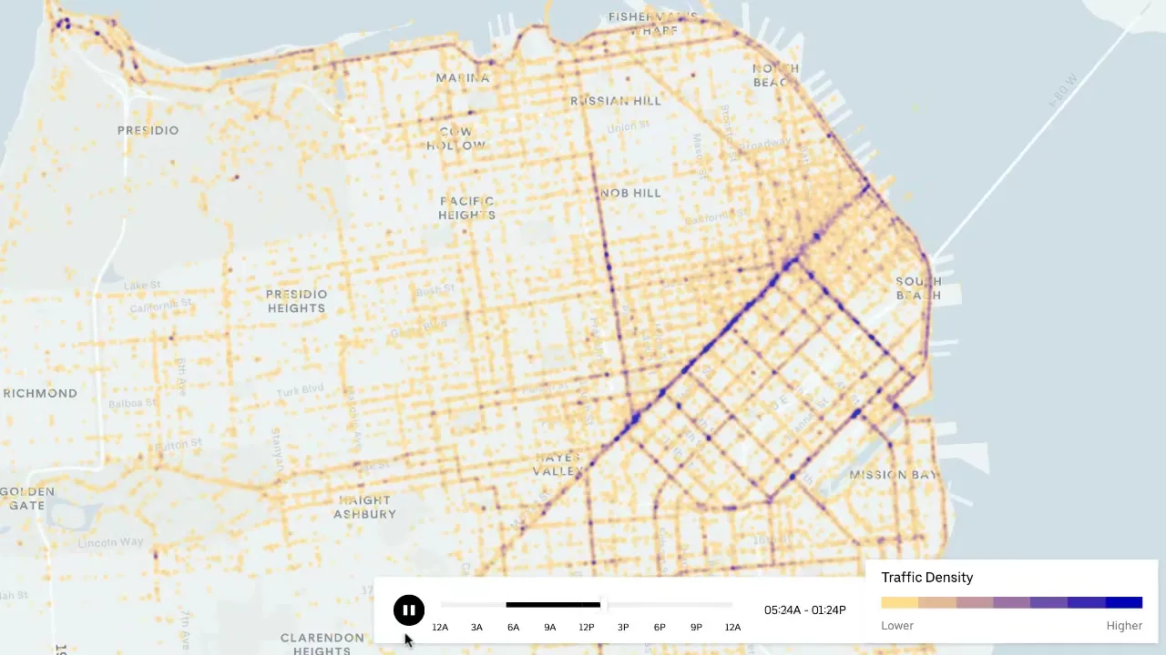
San Francisco Traffic Density with kepler.gl
Uber Movement data animates the city's streets hour by hour, then the same toolkit maps my own attempt at New York crash statistics
Overview
A short one: while living in San Francisco briefly, I set up and ran kepler.gl ↗, Uber’s open-source geospatial explorer, to plot traffic density across the city by hour of day. The recording and the data below are Uber’s example material, nothing of mine. I later ran the same toolkit myself on New York City; that attempt is at the bottom.
Traffic density across San Francisco, played back hour by hour in kepler.gl.
The toolkit
kepler.gl ↗ is Uber’s open-source tool for large-scale geospatial visualization, built on WebGL through deck.gl ↗. It runs straight in the browser at kepler.gl ↗, or self-hosted from the repo.
The workflow that produces something like the animation above takes three moves, following Uber’s own walkthrough ↗:
- Load a dataset with street segments and an hour-of-day field, no account or install needed
- Color the layer by the density/speed column instead of a single color
- Add a filter on the hour field, which turns into the playback control at the bottom, animating the map across the day
The dataset behind maps like this one is the speeds release of Uber Movement ↗, the program where Uber published aggregated travel-time and speed data for cities including San Francisco. The downloadable files were CSVs named movement-speeds-quarterly-by-hod-san-francisco-<year>-Q<n>.csv, speeds per street segment by hour of day (“hod”), with an hourly variant per month. Downloads went through movement.uber.com’s api/download/url endpoint, which issued signed S3 links per city and quarter; Uber’s movement-data-toolkit ↗ (mdt) automates exactly that, and can join the speeds back to OpenStreetMap geometries for GeoJSON export. Movement shut down and the endpoint is dead now, so archived copies and mirrors are the only way back to these files.
What the playback shows
Worth calling out what the animation makes obvious in a way a static map cannot: before dawn only the arterials glow; density builds along the Market Street corridor and the SoMa grid through the morning peak; the whole downtown grid saturates through the afternoon and evening rush; and after midnight it collapses back to a handful of corridors.
This is anecdotal, but the playback matches the city I walked. I lived in San Francisco briefly, and the map renders the rhythm I remember: the morning crawl along Market and the SoMa grid, the downtown evening rush, the quiet after midnight. Seeing the map agree with my own commute is what sold me on the format.
My own attempt: New York City
The same toolkit, pointed at New York City. In this 29-second recording, Movement’s street speed gradients color the roads while government crash data sits on top: NHTSA’s FARS fatal crash records and the NYPD Motor Vehicle Collisions dataset, the combination from Uber’s traffic-safety walkthrough, aimed at traffic-related deaths and better urban planning in New York City.
Shortened simulation of NYC traffic and accident reports.
The reaction when I showed this around was the interesting part. My survey participants were skeptical at first; the map reads as obvious once rendered, yet the same people would never pull crash statistics themselves. That is the value I see in kepler.gl: raw government data with a steep learning curve, made into something anyone can scrub through.
Links
- kepler.gl ↗, the toolkit
- Visualizing Traffic Safety with Uber Movement Data and Kepler.gl ↗, Uber’s walkthrough
- movement-data-toolkit ↗, Uber’s CLI for the Movement data downloads
- deck.gl ↗, the WebGL layers underneath